-
…in reply to @andy_matuschak
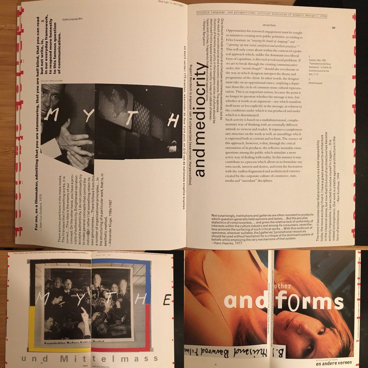
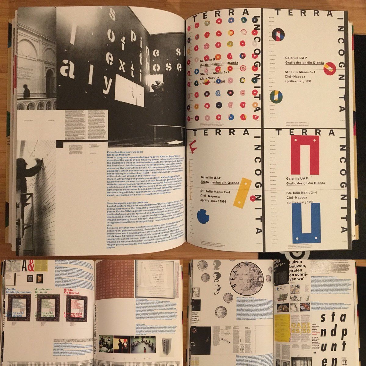
andy_matuschak there's so many parts to this. i think of this the images you posted as a low-rent take on the werkplaats typografie look influenced by jan van toorn + karel martens, imported via "academic" design outfits like yale/risd
-
…in reply to @nsfmc
andy_matuschak i first saw elements of the look you're describing out of markofthemind in ~09 when he visited risd and a) showed the his illustrator-only pseudo-futura b) i sort of assumed was influenced by ~60s-70s era design but with a sort of post-punk irreverence
-
…in reply to @nsfmc
andy_matuschak markofthemind add to that, a sort of zeitgeist of foundries releasing high-profile grot revival superfamilies (eg. klim's founders grot in '13) and boutique geometrics (qv. radim peško) in the past ten years being picked up for higher profile work.
-
…in reply to @nsfmc
andy_matuschak markofthemind also, around the late 00s, this sort of Salon-style layout becomes a generic enough visual motif that it pairs well with that dutch visual of "what is frame" and "where is grid?" and "whose grid is grid?", so those all start blending together & gaining commercial acceptance
-
…in reply to @nsfmc
andy_matuschak markofthemind so much so that it's just throwing a shape by 2013, a sort of procedural aesthetic: make a weird font with a few distinct but not-quite-right glyphs and sort of start breaking things around until they sort of just barely hold up nsfmc.tumblr.com/post/50107799473/i-forget-how-quickly-you-can-hammer-out-these
-
…in reply to @nsfmc
andy_matuschak markofthemind it's sort of a happy confluence of all those, where the yale default systems aesthetic embraced the times bold italic ms word design aesthetic, it's not hard to see the process of photomechanical paste-ups influencing in the visual style you're seeing all over the place.
-
…in reply to @nsfmc
andy_matuschak markofthemind also mark, i'm sorry to have dragged you into these poorly researched tweets, but i still think about that illustrator font you showed in that post punk workshop and it was hugely influential for me just drawing weird fonts for myself, so thank you even tho my ep covers sucked
 nsfmc’s Twitter Archive—№ 6,503
